Jinko - Silk Screen Prints
I have been very drawn to a series of silk screen prints by
Jinko.
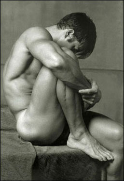
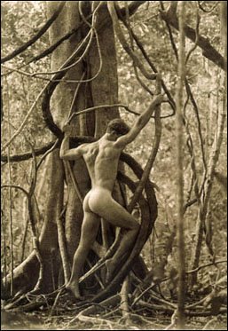
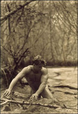
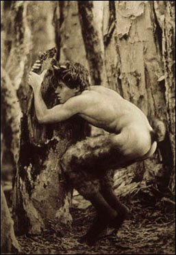
My first reactions to his silk screen prints were really responses to the photographs which they drew on and which I already knew - I liked the originals cos they were of guys I find really hot hot hot. Then I realized I also liked these prints themselves - liked them for something going on in the art work itself, beyond just reminding of the referents. To investigate this, I hunted down some of the original porn pictures to compare with their silk screens.
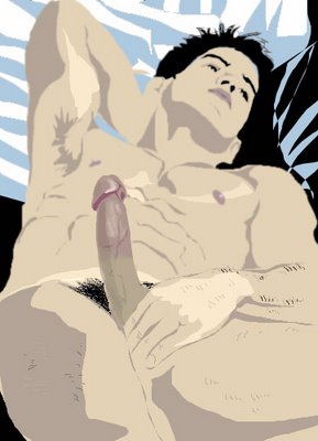


I realized that sometimes the beauty of the formal ideas of the composition of a photo (the way the photographer set up the pose of the subject to balance out forms, etc) can be lost in what is being represented - a sexy bod! And I began to think about how Jinko had brought these formal design aspects back into focus in his prints, without loosing their hot representations. And had used these techniques to bring (erotic) things to the work that weren't in the original photos.
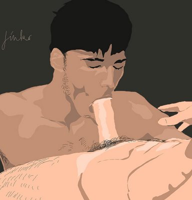
One way he does this by reducing the modeling, which gives the impression of masses and volumes, light and shade, and so on. Where there is grading in the photo (for example, shadows becoming darker as they move out of the light), now there are simple flat-ish shapes of colour in the print. In the second photo for instance, the graded modeling round the left shoulder (white on the high mid point of the muscle down to to brown at the outside edge of the shoulder) is reduced to the simple flat overall pink shape in the print.
Then I started to think about this in more detail.
For example, in the first work below, the gray and the pale cream areas on the right arm still represent the real world entities of shadow and bright-lit high muscle surface but they now achieve the status of independent coloured shapes that can be arranged on the surface of the two dimensional picture. These shapes can then balanced out against other forms and colours, such as, for example, the solid black shape of the hair (no variations in colour now for the 'highlights' of the photo) and the gray of the shadow under the jaw.
Again, the lines that represent shadows around the masses of pecs and abs now have a purely formal function is the design of the two dimensional surface of the print.
Finally, the head of the cock in the second photo is two dimensional and not colour-distinguished from the shaft, but is so differentiated in the screen print - as dark pink. The end of the dick is now a separate element in the design. This change adds to the eroticism of the work - focuses something we (I) think about more than a little.
There are other ways in which there is a move away from simple representation for artistic and erotic purposes.
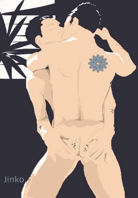
The various shadows around the butt in the second photo (dark in the crack but paler under the buns) are simplfied into just one gray shape in the print, with only one dark area in the print, the pubic hair, for emphasis. A dark crack is a hot turn on for me - this is obviously an individual artistic choice!.
A few more Jinko prints to look at:



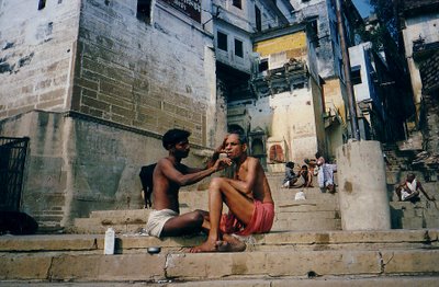
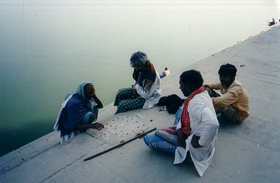
 People at work and rest:
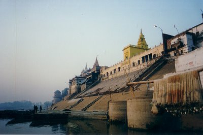
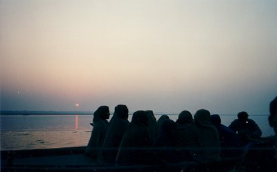
 Mourners on the river at dusk:
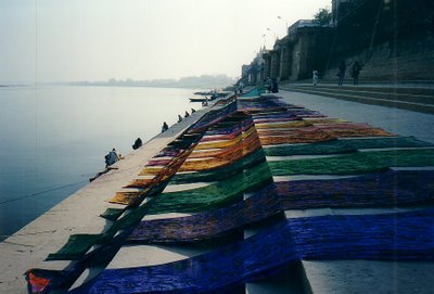
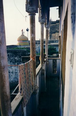
 Laundry day:
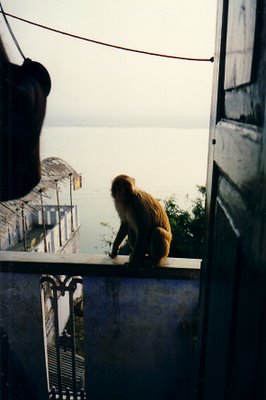
 Monkey raids on the hotel balcony:
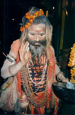
 A holy man - a saddhu:









![C18 Bronze Buddha [Southern China]](https://blogger.googleusercontent.com/img/b/R29vZ2xl/AVvXsEioLkgVKuhDoIHQgM1X6Oe2hGn75yqaj4OJXPmNpumXmQPKxB22S57YS5DVrl1P7zl7BS6EFpAtaNZPze7gzVCRiQI54bwdHhVa4fGr7NOChZwTZoo92gUen6tC5U8gWIy_pv92U0FB38M/s1600/Buddha+%255BBronze%252C+C18%252C+China%255D+1.jpg)




+1998+Cropped.jpg)

